A new book cover’s passage to reveal…
Finding a design that suits the essence of one’s story is one of the most exciting and daunting parts of publishing.For me, this new novel is an excursion into a new genre, a passage into a new style – contemporary fiction.
I have to say that it’s much harder in many ways than writing historical fiction. With the latter, I’m removed from my characters and my storylines by hundreds of years. With contemporary fiction, the time is now, the location is here, the storyline has happened to friends and acquaintances, and characters are a jigsaw of many people I’ve met or observed through the years.
But maybe all this will be more succinctly explained in a further blog post.
This cover is the first time in eleven novels, that I haven’t worked with Floating Studio, my daughter’s design studio. My daughter and I are somewhat sympatico and so she could nuance my desires before I even articulated a word. But she’s flat tack on three massive accounts at the moment, and could not book me in in the timeframe I needed.
So I thought immediately of the one designer whose covers I’ve always liked on friends’ releases – JD Smith.
I admit I was very nervous about working with someone I only know through Facebook and the writing world, because Jane and I live at polar ends of the globe! The big question was how would we get on? Would she understand what I wanted?
But Jane is professional and sharp. She got it immediately.
So how did we work to that point?
She asked me for a blurb and a brief and could I look at covers of contemporary fiction online and send her links of a half dozen or so that stood out.
She then sent me Stock pics to comment on and…
…by return, I sent her actual shots that I had. These are samples of a few.
She then worked the first mock-up.
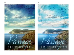
Not easy to see here – I chose which one I liked the most from that which was G. But after 24 hours reflection, I decided it was too calm for what is quite a rough passage for Annie Tremayne.
We came up with an image that reflects Annie’s watershed moment. That’s D2. And then it was full-steam ahead from there. We had a look at texture and decided it didn’t work and that a stormy sky overlaid with the map was best.
And now, I have my cover for Passage, to be released as an e-book at the end of May this year.
(Print in early June and audio not far behind.)
Links and details to come.
Thank you, Jane, for giving me all I wanted in such a swift, professional and easy manner.










WOW!! What a cover! Prue, I can’t wait to read this book. I love the sky with the darker blue tones as well.
Thank you, Judy. All power to Jane Dixon-Smith for this one.
Gorgeous! You always have the best covers, Prue!
Thank you, Anne. This one tells the story by visuals alone.
Fascinating Prue, love the cover.
Thanks so much, Libby. Very happy.
Great cover. Can’t wait to read the book.
Thanks, Pat. All things being equal it will be end of May. Keep your eye open on the blog or http://www.facebook.com/Prue.Batten.writer
Cheers and have a great weekend.